Daleska Granados
Work· Experimentation· Teaching
in
✦ UX Research
A/B Test Design ↗
Product Design ◇
UX Professor ✎

Hi! I'm Daleska.
Product designer & UX educator.

For 9+ years I've designed end-to-end experiences for brands like Salesforce, UBS and Banistmo. Today I design A/B test variations at Speero and teach UX at the University of Costa Rica.

See my work → About me ↓
Research Talking to people early and testing ideas before I build.
Product & UI Flows, prototypes, final screens and design systems.
Experimentation A/B test variations, UI audits and page redesigns.
Teaching UX courses and thesis projects at the University of Costa Rica.
Selected work

Some projects I've worked on.

Warriors app home with the Unstoppable bannerStep counter with the rainbow ringChoose a cause: Pride, anti-racism or bothSuccess screen with sharingInstagram story to share your march
SportsMobile app · Featured

Pride Unstoppable

When COVID-19 cancelled the parades, I designed a step counter in the Golden State Warriors app so fans could still "march" for Pride.

View project →
Enterprise SaaSResearch & product design

Salesforce Partner Community

Research and design for the portal Salesforce partners use every day. Built on Salesforce's design system, with 97% task success in testing.

View project →
Redesigned Partner Community homepage
FintechWeb & mobile

Banistmo Digital Banking

Information architecture, flows and a new design system for a bank's apps. About 300 screens.

View project →
Sign-up step 1 wireframe
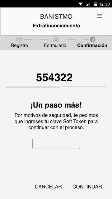
Soft Token confirmation wireframe
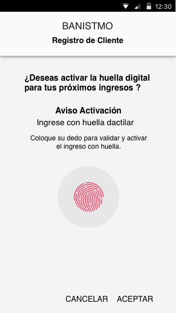
Fingerprint activation wireframe
~300 screens
See all projects →

Right now I design A/B tests at Speero.

UX & UI designer · since 2022

Strategists decide what to test, and I design the variations in Figma. I also do UI audits, heuristic reviews and redesigns.

A/B test variations UI audits Page redesigns Heuristic reviews
MongoDB · Miro · ClickUp · Nasdaq · Philips · Purple Carrot and more
How I work at Speero →
A team effort ✦
Tipalti · optimization program
Leads that became sales opportunities
Before5%
After the program12% to 24%
0%5%10%15%20%25%
A · Original
B · My design ✓

A team result. I designed variations, and the Speero team led strategy and analysis. Sketches are illustrative.

Teaching

I also teach UX.

At the University of Costa Rica, in the UX Design licentiate program.

How I teach →
Intro to UX · User Research

Classes like real projects

I teach two courses, organized in sprints with reviews, retros and real projects.

New this semester

Guiding thesis projects

I advise UX graduation projects, from the first research plan to the final design.

Licentiate program

A new UX curriculum

I helped redesign the UX licentiate curriculum, rebuilding the whole program from scratch.

Daleska Granados smiling
OPEN TO NEW ROLES ✦ OPEN TO NEW ROLES ✦

A bit more about me.

I'm a product designer with a background in Computer Science. I moved into UX because I'm curious about how people use technology, and my technical side helps me work closely with engineers.

I'm creative and analytical. I like clear, organized work, and I pay attention to how people feel, which makes me a good listener in research and in teams.

Education
  • ↳ BSc Computer Science
  • ↳ Licentiate in UX Design
  • ↳ Erasmus Mundus scholar
  • ↳ NN/g, CXL and CIID courses
Outside work
PhotographyYogaSewingScuba diving
LinkedIn ↗

Let's talk!

I'm looking for a product design role where I can own the experience end to end. If that sounds like your team, I'd love to connect.

Connect on LinkedIn ↗ daleskagm@gmail.com
© 2026 Daleska Granados Illustrations by Streamline
Daleska Granados
✦ UX Research A/B Test Design ↗ UX Professor ✎

Hi! I'm Daleska. Product designer & UX educator.

For 9+ years I've designed end-to-end experiences for brands like Salesforce, UBS and Banistmo. Today I design A/B test variations at Speero and teach UX at the University of Costa Rica.

See my work → About me ↓
Research
Product & UI
Experimentation
Teaching
Selected work

Some projects I've worked on.

Warriors app home with the Unstoppable bannerStep counter with the rainbow ringChoose a cause: Pride, anti-racism or both
SportsMobile app · Featured

Pride Unstoppable

When COVID-19 cancelled the parades, I designed a step counter in the Golden State Warriors app so fans could still "march" for Pride.

View project →
Redesigned Partner Community homepage
Enterprise SaaSResearch & product design

Salesforce Partner Community

Research and design for the portal Salesforce partners use every day. Built on Salesforce's design system, with 97% task success in testing.

View project →
Sign-up step 1 wireframe
Soft Token confirmation wireframe
Fingerprint activation wireframe
FintechWeb & mobile

Banistmo Digital Banking

Information architecture, flows and a new design system for a bank's apps. About 300 screens.

View project →
See all projects →

Right now I design A/B tests at Speero.

UX & UI designer · since 2022

Strategists decide what to test, and I design the variations in Figma.

A/B test variations UI audits Page redesigns Heuristic reviews
MongoDB · Miro · ClickUp · Nasdaq · Philips · Purple Carrot and more
How I work at Speero →
A team effort ✦
Tipalti · optimization program
Leads that became sales opportunities
Before5%
After the program12% to 24%
0%10%20%25%

A team result. I designed variations, and the Speero team led strategy and analysis.

Teaching

I also teach UX.

At the University of Costa Rica, in the UX Design licentiate program.

How I teach →
Intro to UX · User Research

Classes like real projects

I teach two courses, organized in sprints with reviews, retros and real projects.

New this semester

Guiding thesis projects

I advise UX graduation projects, from the first research plan to the final design.

Licentiate program

A new UX curriculum

I helped redesign the UX licentiate curriculum, rebuilding the whole program from scratch.

Daleska Granados smiling
OPEN TO NEW ROLES ✦ OPEN TO NEW ROLES ✦

A bit more about me.

I'm a product designer with a background in Computer Science. I moved into UX because I'm curious about how people use technology, and my technical side helps me work closely with engineers.

I'm creative and analytical. I like clear, organized work, and I pay attention to how people feel, which makes me a good listener in research and in teams.

Education
  • ↳ BSc Computer Science
  • ↳ Licentiate in UX Design
  • ↳ Erasmus Mundus scholar
  • ↳ NN/g, CXL and CIID courses
Outside work
PhotographyYogaSewingScuba diving
LinkedIn ↗

Let's talk!

I'm looking for a product design role where I can own the experience end to end. If that sounds like your team, I'd love to connect.

Connect on LinkedIn ↗daleskagm@gmail.com
© 2026 Daleska Granados · Illustrations by Streamline
Daleska Granados
Work· Experimentation· Teaching
in
← All work
Enterprise SaaS UX research Product design

Salesforce Partner Community

I led the redesign of the portal Salesforce partners use every day, and tested each part with them.

Role
UX lead, Costa Rica team
Team
3 designers + Accenture SF
Duration
About 4 months
Tools
Figma · Mural + more
Navigator screen with partner progress and points
Redesigned Partner Community homepage
Leads page in Customer Success Events page with filters
The problem

Partners couldn't tell what needed their attention.

The portal showed everything at once. The job was deciding what to keep, rename or remove.

Salesforce wanted to show everything
Partners wanted to see what needs them today
How I listened

I tested every part while designing it.

Four short studies with real partners and a Figma prototype.

Partners per study
Homepage
8
Navigator
11
Customer Success
10
Learning
15
AMERLATAMEMEAAPAC
What I heard

What partners told us.

10/11

Names were confusing

"L1", "Level 1" and "L1 Specialization" meant the same thing.

7/8

One summary, please

"I now would START using the Homepage."

8.8/ 10

Trailhead set the bar

So I designed learning paths by role, with short content.

Making sense of it

I mapped the findings with the team.

It helped the team agree on the problem before designing anything.
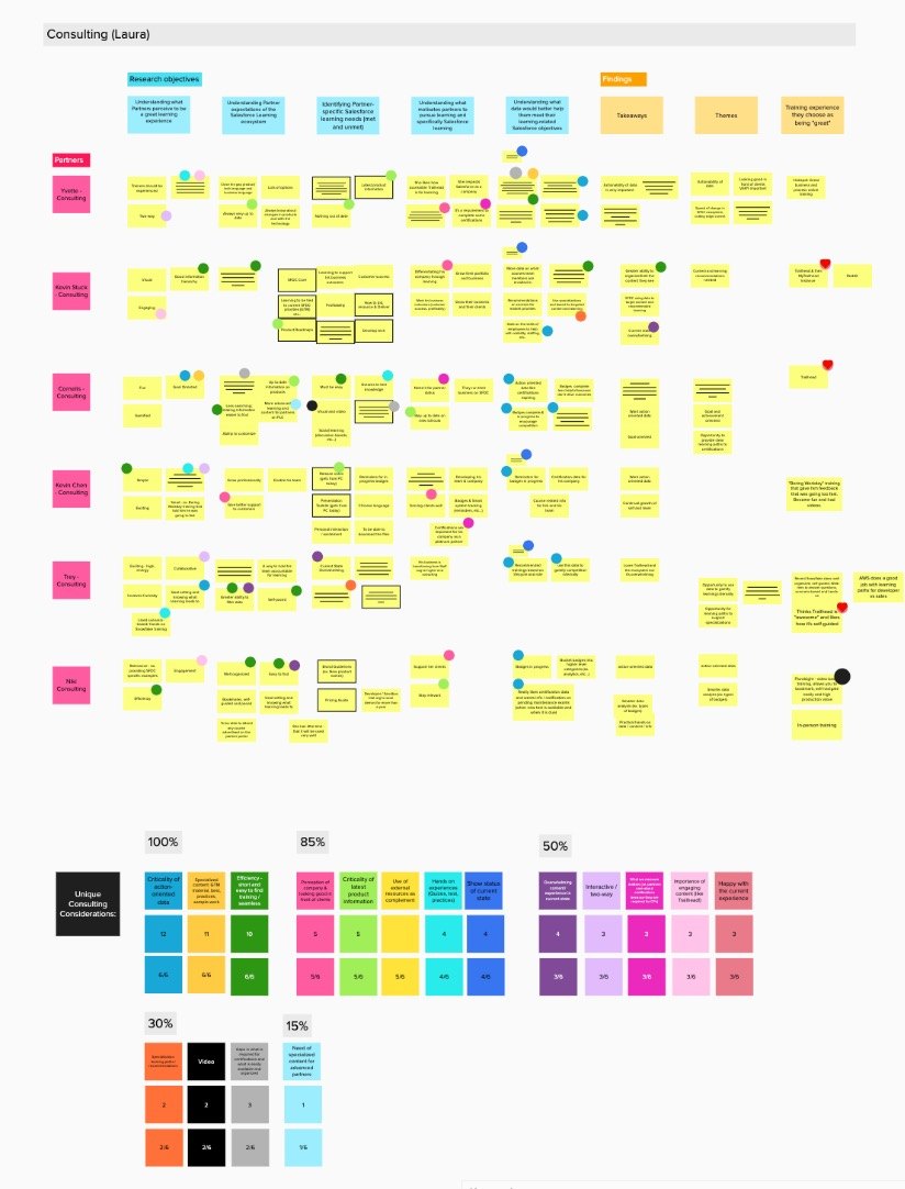
Affinity mapping of research notes in Mural
Ecosystem map of partner learning resources

Three better versions of Navigator in one week.

With RITE testing, I fixed the prototype between sessions.

MonFirst sessions
Wed8 changes
Fri6 refinements
Final Navigator design showing partner progress
Decisions

What I changed and what I left for later.

✕ Removed

Like / Dislike buttons

Partners feared "dislike" would hurt them.

+ Added now

Navigator stats on Home

Partners wanted to see their progress first.

→ Later

A customizable Home

A good idea, but too big for this phase.

Results

97% of tasks completed.

10 partners, 7 tasks in Customer Success. "I like how I can gain a little more visibility."

How useful each feature felt
Activity log
76%
Recent activity
74%
Project links
73%
Take action
72%
Auto-created projects
68%
Comments
64%
The design

The final design.

Homepage
Partner Community homepage with For You and Your Business sections
Leads & opportunities
Opportunities page with items that need partner action
Events & news
Events page with region and product filters
Design system

Built on Salesforce's design system.

I followed the Salesforce Lightning Design System to the letter, pixel perfect. The portal feels like the rest of Salesforce, and engineering could build it as designed.

Lightning components only
Buttons, cards, tables and filters straight from the system.
Tokens for spacing, type and color
No custom values, so every page felt like one product.
Pixel-perfect specs
Detailed handoff, so what shipped matched the design.
What I learned

My best decisions came from listening to partners and taking things out.

Hi-fi designs Lightning Design System Dev specs Research reports Executive review
Next project →
Banistmo Digital Banking
View project →

Let's talk!

I'm looking for a product design role where I can own the experience end to end. If that sounds like your team, I'd love to connect.

Connect on LinkedIn ↗ daleskagm@gmail.com
© 2026 Daleska Granados Illustrations by Streamline
Daleska Granados
← All work
Enterprise SaaSUX researchProduct design

Salesforce Partner Community

I led the redesign of the portal Salesforce partners use every day, and tested each part with them.

Role
UX lead, Costa Rica team
Team
3 designers + Accenture SF
Duration
About 4 months
Tools
Figma · Mural + more
Redesigned Partner Community homepage
The problem

Partners couldn't tell what needed their attention.

The portal showed everything at once. The job was deciding what to keep, rename or remove.

Salesforce wanted
to show everything
Partners wanted
to see what needs them today
How I listened

I tested every part while designing it.

Four short studies with real partners and a Figma prototype.

Partners per study
Homepage8
Navigator11
Customer Success10
Learning15
AMERLATAMEMEAAPAC
What I heard

What partners told us.

10/11

Names were confusing

"L1", "Level 1" and "L1 Specialization" meant the same thing.

7/8

One summary, please

"I now would START using the Homepage."

8.8/10

Trailhead set the bar

So I designed learning paths by role, with short content.

Making sense of it

I mapped the findings with the team.

It helped the team agree on the problem before designing anything.
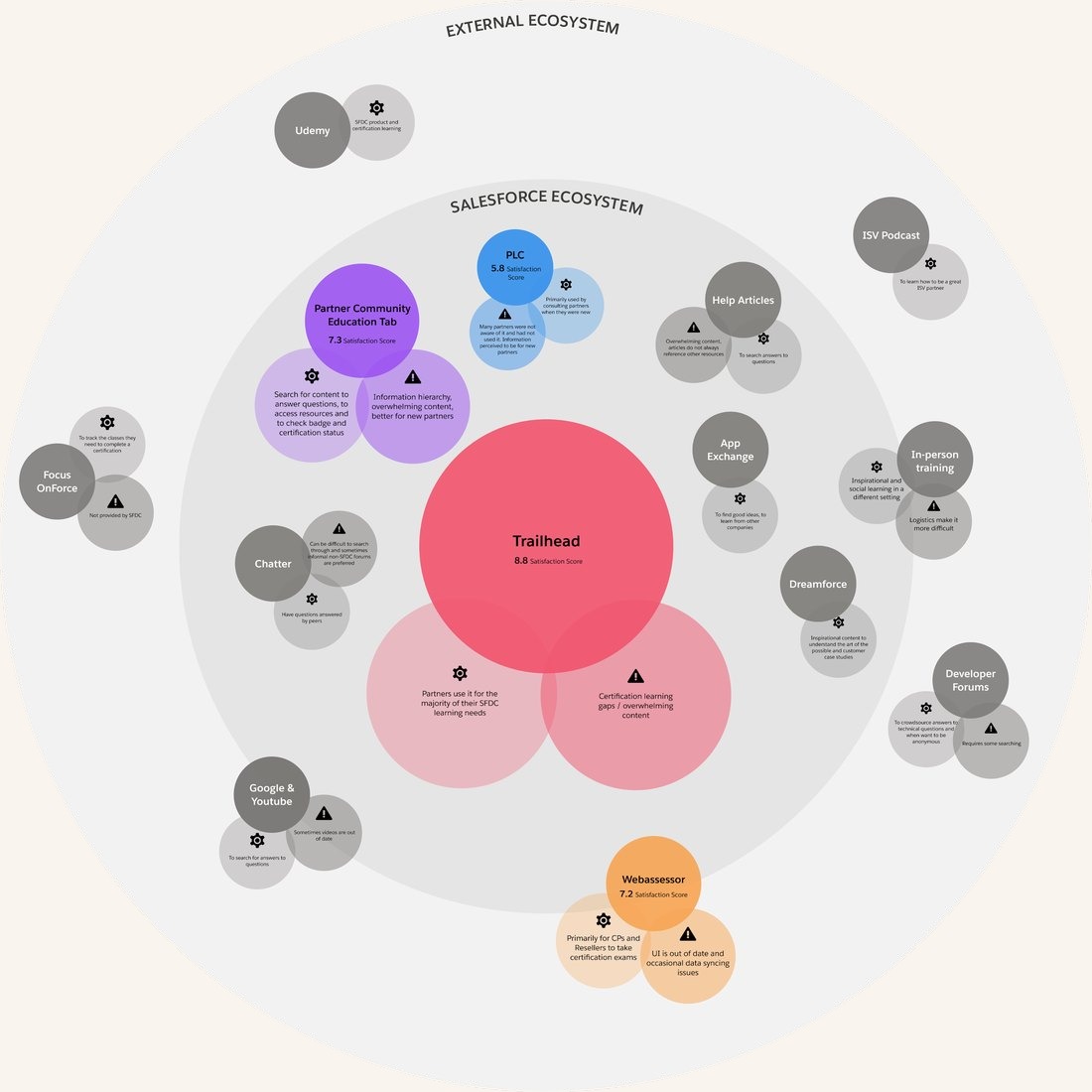
Affinity mapping of research notes in Mural
Affinity map in Mural
Ecosystem map of partner learning resources
Ecosystem map

Three better versions of Navigator in one week.

With RITE testing, I fixed the prototype between sessions.

MonFirst sessions
Wed8 changes
Fri6 refinements
Final Navigator design showing partner progress
Decisions

What I changed and what I left for later.

✕ Removed

Like / Dislike buttons

Partners feared "dislike" would hurt them.

+ Added now

Navigator stats on Home

Partners wanted to see their progress first.

→ Later

A customizable Home

A good idea, but too big for this phase.

Results

97% of tasks completed.

10 partners, 7 tasks in Customer Success. "I like how I can gain a little more visibility."

How useful each feature felt
Activity log76%
Recent activity74%
Project links73%
Take action72%
Auto-created projects68%
Comments64%
The design

The final design.

Homepage
Partner Community homepage
Leads & opportunities
Opportunities page
Events & news
Events page with filters
Design system

Built on Salesforce's design system.

I followed the Salesforce Lightning Design System to the letter, pixel perfect. The portal feels like the rest of Salesforce, and engineering could build it as designed.

Lightning components only
Buttons, cards, tables and filters straight from the system.
Tokens for spacing, type and color
No custom values, so every page felt like one product.
Pixel-perfect specs
Detailed handoff, so what shipped matched the design.
What I learned

My best decisions came from listening to partners and taking things out.

Hi-fi designsLightning Design SystemDev specsResearch reportsExecutive review
Next project →
Banistmo Digital Banking
View project →

Let's talk!

I'm looking for a product design role where I can own the experience end to end. If that sounds like your team, I'd love to connect.

Connect on LinkedIn ↗daleskagm@gmail.com
© 2026 Daleska Granados · Illustrations by Streamline
Daleska Granados
Work· Experimentation· Teaching
in
← All work
Fintech Mobile banking Information architecture

Banistmo Digital Banking

Making everyday banking clearer for people, businesses and the bank agents who serve customers in their neighborhood.

Role
Interaction design & info architecture
Client
Banistmo, at Accenture
Platforms
App · Web · Agent app
Tools
Sketch · Abstract · InVision + more
Information architecture map of the mobile app
1Information architecture
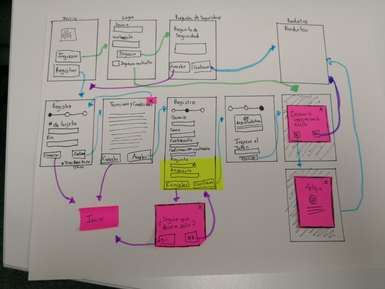
Paper sketch of the sign-up flow with sticky notes
2Sketch
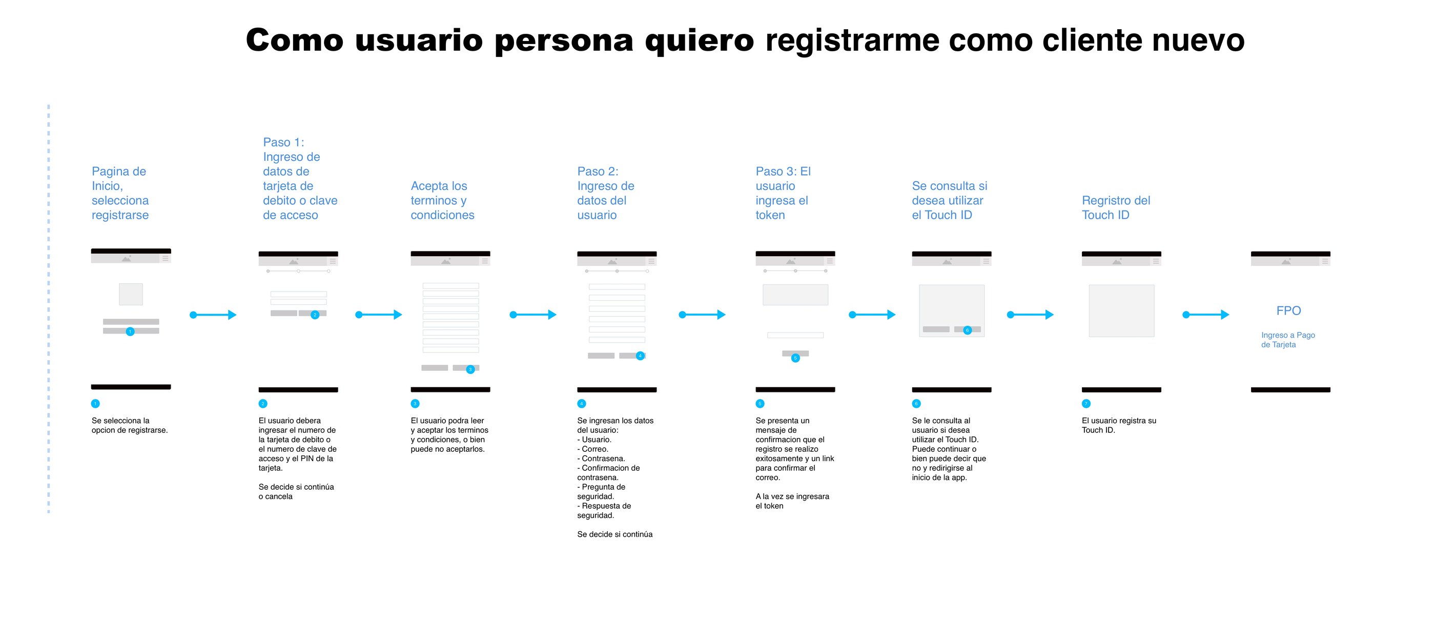
Sign-up wireflow with every step and rule
3Wireflow
Wireframe of the security step
4Wireframes
The problem

Each product worked in its own way.

Every app had its own menus and names. People needed one clear way to bank on any device.

People
App + web
Businesses
Web
Agents (CNB)
Agent app
The goal
One clear way to move around, for everyone
Information architecture

I reorganized every service into three menus.

I mapped every service in the current apps, level by level, and grouped them by what people came to do.
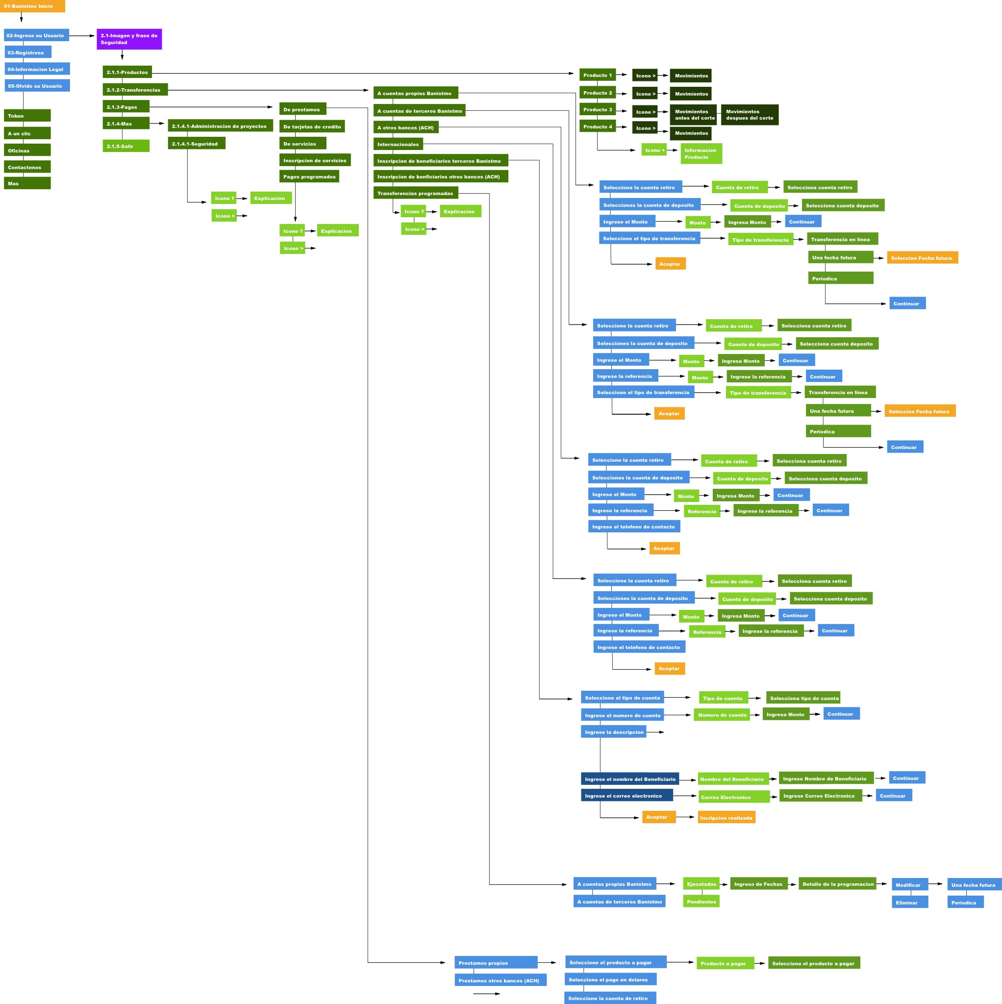
Full mobile navigation map with every transfer and payment path
The full mobile map, every path included
New navigation · Personal banking
Main menu
Products
Accounts · Cards · Loans · Investments
Transfers
Banistmo · Other banks · International
Payments
Cards · Loans · Services · Scheduled
Settings
Registered accounts · Scheduling
Top menu
NotificationsLog out
User bar
My profileSecurityHelp
The same model works for business banking, with a few extra areas for teams and approvals.
How I worked

From paper to wireflows to screens.

I designed the visual UI too, but those files stayed with the client. Here I show the UX work behind it.

1Sketch
Paper sketch of the sign-up wireflow with sticky notes

Quick paper flows and sticky notes to agree on the steps.

2Wireflow
Sign-up wireflow with each step, its fields and actions

Each step with its fields, actions and rules, so developers knew exactly what happens.

3Screens
Wireframe of the first sign-up step

Wireframes for every state and error.

New customer sign-up

Sign-up in three steps, with a way out on every screen.

A progress bar shows where you are, and security checks come one at a time. Fingerprint login is optional.
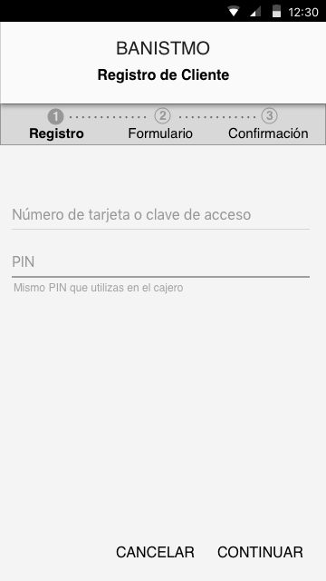
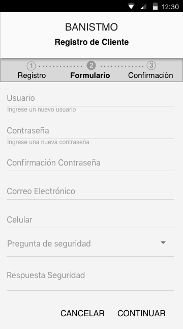
Step 1: enter debit card or access key and PIN
12
1 · Your card
Step 2: create user, password and security question
2 · Your details
Step 3: confirm with Soft Token
3
3 · Confirm
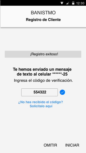
SMS code check with option to resend
SMS check
Optional fingerprint activation
4
Fingerprint
1A progress bar, so you always know where you are
2Cancel on every screen, with a check before losing data
3One security check at a time
4Fingerprint login is offered, never forced

Two people, one transaction.

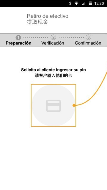
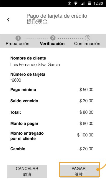
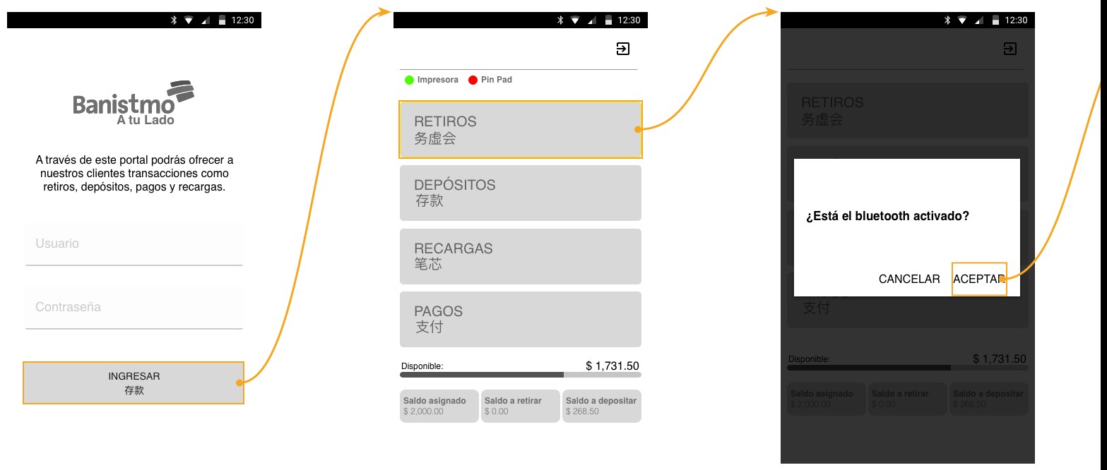
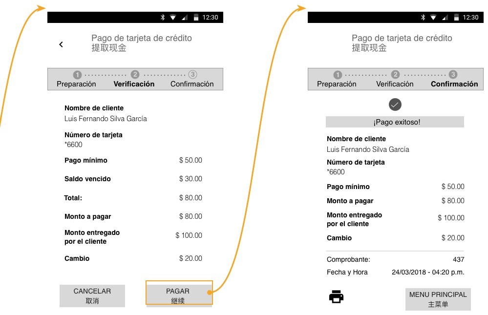
Bank agents (CNB) are local shops where people can withdraw cash, deposit or pay. The agent uses the app, and the customer only steps in for the card and PIN. Many agents are Chinese-Panamanian, so the screens are in Spanish and Chinese.
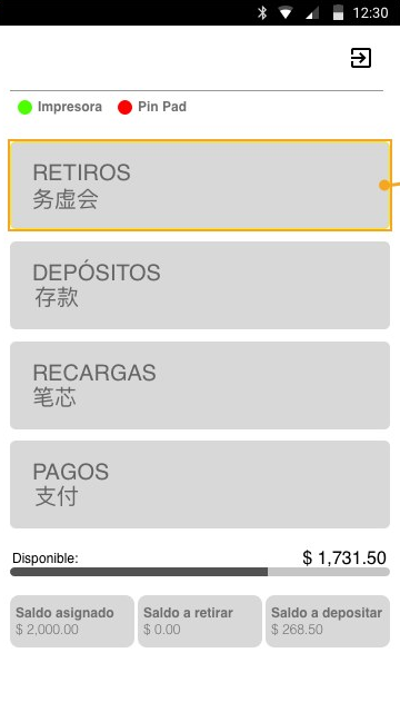
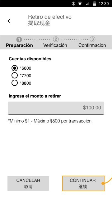
Agent
Agent picks a service: withdrawals, deposits, top-ups, payments
1Pick a service
Agent picks the account and enters the amount
2Enter the amount
Agent checks the payment details with the customer
4Check details
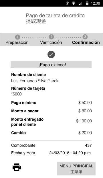
Success screen with receipt and print option
5Print receipt
Customer
Customer inserts card and types PIN on the PIN pad
3Card + PIN
Details that mattered PIN pad & printer checked firstBig number padLimits shown before typingSpanish + Chinese labels Screens from the cash withdrawal and card payment flows
Design system

I helped build the design system from scratch.

The app, the web branch and the agent app had to feel like the same bank, so the team and I made one set of components, styles and patterns for all three.

The UI library stayed with the client, so I can only show its structure here.

Mobile app
Web branch
Agent app
One design system
Components Styles Patterns Documentation
What I delivered

Some of the flows I designed.

These are five of them. There were more, shipped in packs so engineering could start building while I kept designing.

Pack 1New customer sign-upApp
Pack 2Deposits to an accountApp
Pack 2Service top-upsAgent app
Pack 3Cash withdrawal with debit cardAgent app
Pack 3Credit card payment in cashAgent app
Agent app, from login to receipt
Agent app login, services menu and Bluetooth check
Credit card payment verification and success screens with receipt details
What I learned

In banking, people trust small details, like knowing which step they're on or getting a clear receipt.

Information architecture User flows Wireflows Wireframes Design system Responsive UI Design documentation
Next project →
Pride Unstoppable
View project →

Let's talk!

I'm looking for a product design role where I can own the experience end to end. If that sounds like your team, I'd love to connect.

Connect on LinkedIn ↗ daleskagm@gmail.com
© 2026 Daleska Granados Illustrations by Streamline
Daleska Granados
← All work
FintechMobile bankingInformation architecture

Banistmo Digital Banking

Making everyday banking clearer for people, businesses and the bank agents who serve customers in their neighborhood.

Role
Interaction design & info architecture
Client
Banistmo, at Accenture
Platforms
App · Web · Agent app
Tools
Sketch · Abstract · InVision + more
Information architecture map of the mobile app
1Information architecture
Paper sketch of the sign-up flow with sticky notes
2Sketch
Sign-up wireflow with every step and rule
3Wireflow
Wireframe of the security step
4Wireframes
The problem

Each product worked in its own way.

Every app had its own menus and names. People needed one clear way to bank on any device.

People
App + web
Businesses
Web
Agents (CNB)
Agent app
The goal
One clear way to move around, for everyone
Information architecture

I reorganized every service into three menus.

I mapped every service in the current apps, level by level, and grouped them by what people came to do.

New navigation · Personal banking
Main menu
Products
Accounts · Cards · Loans · Investments
Transfers
Banistmo · Other banks · International
Payments
Cards · Loans · Services · Scheduled
Settings
Registered accounts · Scheduling
Top menuNotifications
Log out
User barMy profile
Security
Help
Full mobile navigation map
The full mobile map, every path included
How I worked

From paper to wireflows to screens.

I designed the visual UI too, but those files stayed with the client. Here I show the UX work behind it.

Paper sketch of the sign-up wireflow
1 · Sketch on paper
Sign-up wireflow with fields and actions
2 · Wireflow with every rule
Wireframe of the first sign-up step
3 · Wireframes for every state
New customer sign-up

Sign-up in three steps, with a way out on every screen.

Step 1: card and PIN
1 · Card
Step 2: details
2 · Details
Step 3: confirm
3 · Confirm
1A progress bar, so you always know where you are
2Cancel on every screen, with a check before losing data
3One security check at a time
4Fingerprint login is offered, never forced

Two people, one transaction.

Bank agents (CNB) are local shops where people can withdraw cash, deposit or pay. The agent uses the app, and the customer only steps in for the card and PIN. Many agents are Chinese-Panamanian, so the screens are in Spanish and Chinese.
Pick a service
Agent
1Pick a service
Enter the amount
Agent
2Enter the amount
Card + PIN
Customer
3Card + PIN
Check details
Agent
4Check details
Print receipt
Agent
5Print receipt
Design system

I helped build the design system from scratch.

The app, the web branch and the agent app had to feel like the same bank, so the team and I made one set of components, styles and patterns for all three.

Mobile app
Web branch
Agent app
One design system
ComponentsStylesPatternsDocumentation

The UI library stayed with the client, so I can only show its structure here.

What I delivered

Some of the flows I designed.

These are five of them. There were more, shipped in packs so engineering could start building while I kept designing.
Pack 1New customer sign-upApp
Pack 2Deposits to an accountApp
Pack 2Service top-upsAgent
Pack 3Cash withdrawalAgent
Pack 3Card payment in cashAgent
What I learned

In banking, people trust small details, like knowing which step they're on or getting a clear receipt.

Information architectureUser flowsWireflowsWireframesDesign systemResponsive UI
Next project →
Pride Unstoppable
View project →

Let's talk!

I'm looking for a product design role where I can own the experience end to end. If that sounds like your team, I'd love to connect.

Connect on LinkedIn ↗daleskagm@gmail.com
© 2026 Daleska Granados · Illustrations by Streamline
Daleska Granados
Work· Experimentation· Teaching
in
← All work
Sports Social impact Mobile UI

Pride Unstoppable

When COVID-19 cancelled the 50th San Francisco Pride Parade, I designed a step counter for the Golden State Warriors app, and fans marched from wherever they were.

Role
UX & UI designer
Client
Golden State Warriors, at Accenture
Platform
Mobile app
Tools
Sketch · InVision · Mural + more
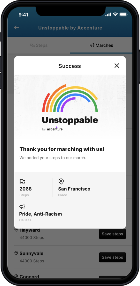
Warriors app home with the Unstoppable Pride banner
Step counter ready to start
You're unstoppable: 2,068 steps with a rainbow ring
Pick a cause: Pride, anti-racism or both
Success screen with sharing
The question

What does Pride look like when not everyone can march?

The world was changing every week while I designed. I kept checking the news and adjusting the idea.

Parades cancelled by the pandemic Black Lives Matter protests Pride still banned in some countries
"History isn't something you look back at and say it was inevitable. It happens because people make decisions."
Marsha P. Johnson · the quote that opened the project deck
Unstoppable logo, a rainbow of arcs
1979
The rainbow flag at the Gay Freedom Day Parade
2017
Philadelphia adds colors for people of color
2018
The Progress flag adds trans colors
The idea

From "we march for the ones who can't" to "walk for what you care about."

The first concept came from Shackleton, an agency in Chile. I turned it into an action, where every step you walk counts for a cause. The logo arcs follow the history of the Pride flag.

Interaction flow

A small feature inside the Golden State Warriors app.

Fans find it from a banner on the home screen. Everything starts from the step counter.

Banner
Steps
Marches
Cause
Success
Share
Information
History

Every step paints the rainbow.

The rainbow ring fills up as you walk. There's no finish line, so even a short walk counts.

Ready to march: 0 stepsReady
Marching: the ring fills with colorMarching
Well done: pick a community to add your stepsWell done
Marches list: Bay Area communities and continentsWhere you march
Choose a cause: Pride, anti-racism or bothWhy you march
Marches & causes

Pick where you march and why.

Fans choose a Bay Area community or a continent. When the Black Lives Matter protests grew, I added anti-racism as a second cause.
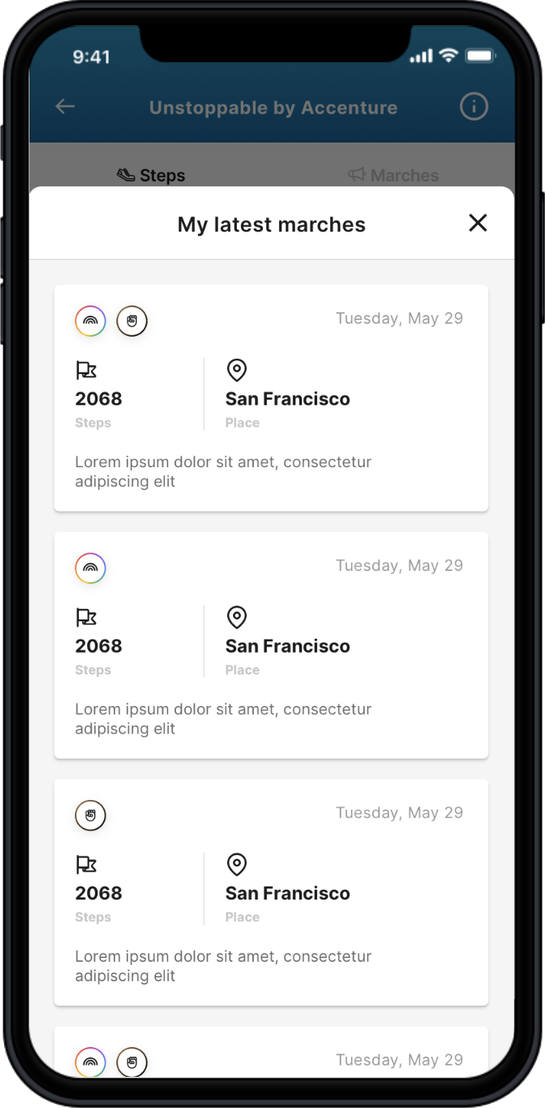
Version 2

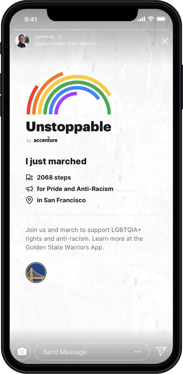
Version 2 added history and sharing.

History of your marches
History made by your steps
Success: thank you for marching with us
Thank-you screen
Instagram story to share your march
Instagram story
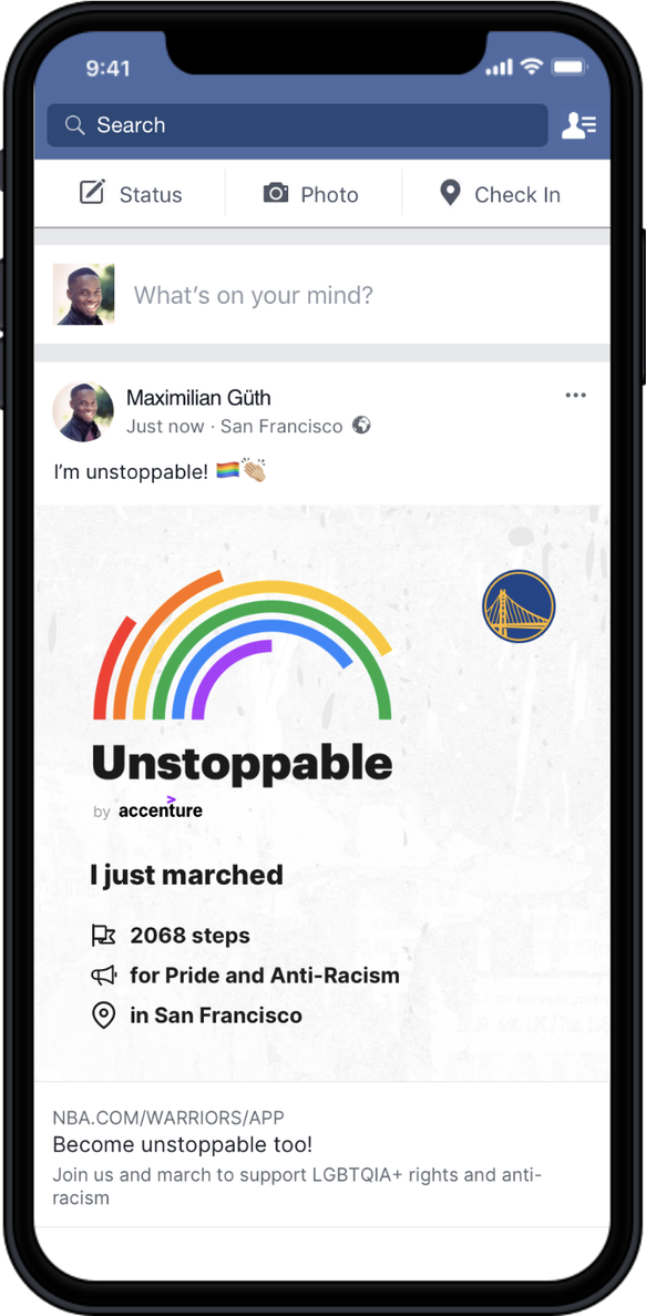
Facebook post to share your march
Facebook post
What I learned

With a sensitive topic, I learned to listen first. Research and open talks with the team made the design better.

Desk researchInteraction flowWireframesHi-fi UISketch UI libraryVisual identitySocial share assetsDev handoff
Next project →
Salesforce Partner Community
View project →

Let's talk!

I'm looking for a product design role where I can own the experience end to end. If that sounds like your team, I'd love to connect.

Connect on LinkedIn ↗ daleskagm@gmail.com
© 2026 Daleska Granados Illustrations by Streamline
Daleska Granados
← All work
SportsSocial impactMobile UI

Pride Unstoppable

When COVID-19 cancelled the 50th San Francisco Pride Parade, I designed a step counter for the Golden State Warriors app, and fans marched from wherever they were.

Role
UX & UI designer
Client
Golden State Warriors, at Accenture
Platform
Mobile app
Tools
Sketch · InVision · Mural + more
Warriors app home with the Unstoppable bannerStep counter with the rainbow ringChoose a cause: Pride, anti-racism or both
The question

What does Pride look like when not everyone can march?

The world was changing every week while I designed. I kept checking the news and adjusting the idea.

Parades cancelled by the pandemicBlack Lives Matter protestsPride still banned in some countries
"History isn't something you look back at and say it was inevitable. It happens because people make decisions."
Marsha P. Johnson · the quote that opened the project deck
The idea

From "we march for the ones who can't" to "walk for what you care about."

The first concept came from Shackleton, an agency in Chile. I turned it into an action, where every step you walk counts for a cause. The logo arcs follow the history of the Pride flag.

Unstoppable logo
1979
The first rainbow flag
2017
Colors for people of color
2018
The Progress flag
Interaction flow

A small feature inside the Golden State Warriors app.

Fans find it from a banner on the home screen. Everything starts from the step counter.

1
Banner
2
Steps · Information & History
3
Marches
4
Cause
5
Success
6
Share

Every step paints the rainbow.

The rainbow ring fills up as you walk. There's no finish line, so even a short walk counts.

Ready to march: 0 stepsReady
Marching: the ring fills with colorMarching
Well doneWell done
Marches & causes

Pick where you march and why.

Fans choose a Bay Area community or a continent. When the Black Lives Matter protests grew, I added anti-racism as a second cause.
Marches listWhere you march
Choose a causeWhy you march
Version 2

Version 2 added history and sharing.

History of your marches
Your march history
Thank-you screen
Thank-you screen
Instagram story
Instagram story
Facebook post
Facebook post
What I learned

With a sensitive topic, I learned to listen first. Research and open talks with the team made the design better.

Desk researchInteraction flowWireframesHi-fi UISketch UI libraryVisual identityDev handoff
Next project →
Salesforce Partner Community
View project →

Let's talk!

I'm looking for a product design role where I can own the experience end to end. If that sounds like your team, I'd love to connect.

Connect on LinkedIn ↗daleskagm@gmail.com
© 2026 Daleska Granados · Illustrations by Streamline
Daleska Granados
Work· Experimentation· Teaching
in
← Home
UI design A/B testing Design systems

My work at Speero

Speero helps brands test and improve their websites. I'm one of the designers. I work every day with strategists, analysts and developers, and my part is the design.

Below, a real test file with the client's brand hidden.

Role
UX & UI designer
Since
2022
Team
Remote, many countries
Tools
Figma · Miro · Claude + more
Original · desktop
Control page from a real test file, client brand hidden
My variant · desktop
Variant page I designed, client brand hidden
My variant · mobile
Mobile variant I designed, client brand hidden
What I do

UI design is most of my work, but not all of it.

Most of my time

A/B test design

A strategist brings the idea. I turn it into wireframes and final UI for desktop and mobile. On a normal day that's two tests, sometimes more.

I helped shape the method

UI audits

I look at the visual side of a site, find what feels off and suggest what to fix first.

With the strategists

Heuristic reviews

With the strategists, I go through live sites, mostly online stores, and write down what makes buying harder.

Homepages, product pages, full sites

Page redesigns

Sometimes one test isn't enough and the page needs a full redesign.

In every project

Visual design

Clean UI that matches each brand and is ready for the developers.

Now and then

Speero's own brand

The event t-shirts for two years, presentation templates for client work and a few social posts.

Many clients, many ways of working

A different client almost every day.

Clients change during the week, and each team works its own way. Some want rough ideas, others want final screens that I review with their developers. It has made me quick to adapt, and I like that.

If they have a libraryI use their components and keep everything connected in Figma.
If they don'tI study the live site, find the components it uses, rebuild them and organize them into a system.
What a client might ask for
Ideas
Wireframes
Final UI
Pixel perfect for dev
Design systems with Claude

Each client, in one place.

Every client has its own brand, components and rules. With Claude I've built around 14 design systems that keep all of that in one place. When a new test comes in, I start from the right colors, type and components, so my time goes to the idea and the details.

~14
design systems built
One source
for each brand and its components
Faster from idea to design, and consistent from one test to the next.

How a test moves through the team.

Each test goes through several people in different countries, and a project manager keeps it on track. I work close to the CRO side, but I'm the designer. I don't run the analysis.

1 Strategist Brings the idea
2 Me Designs it in Figma
3 Developer Builds the test
4 QA Checks it
5 Analyst Looks at the results
UI audits

How I run a UI audit.

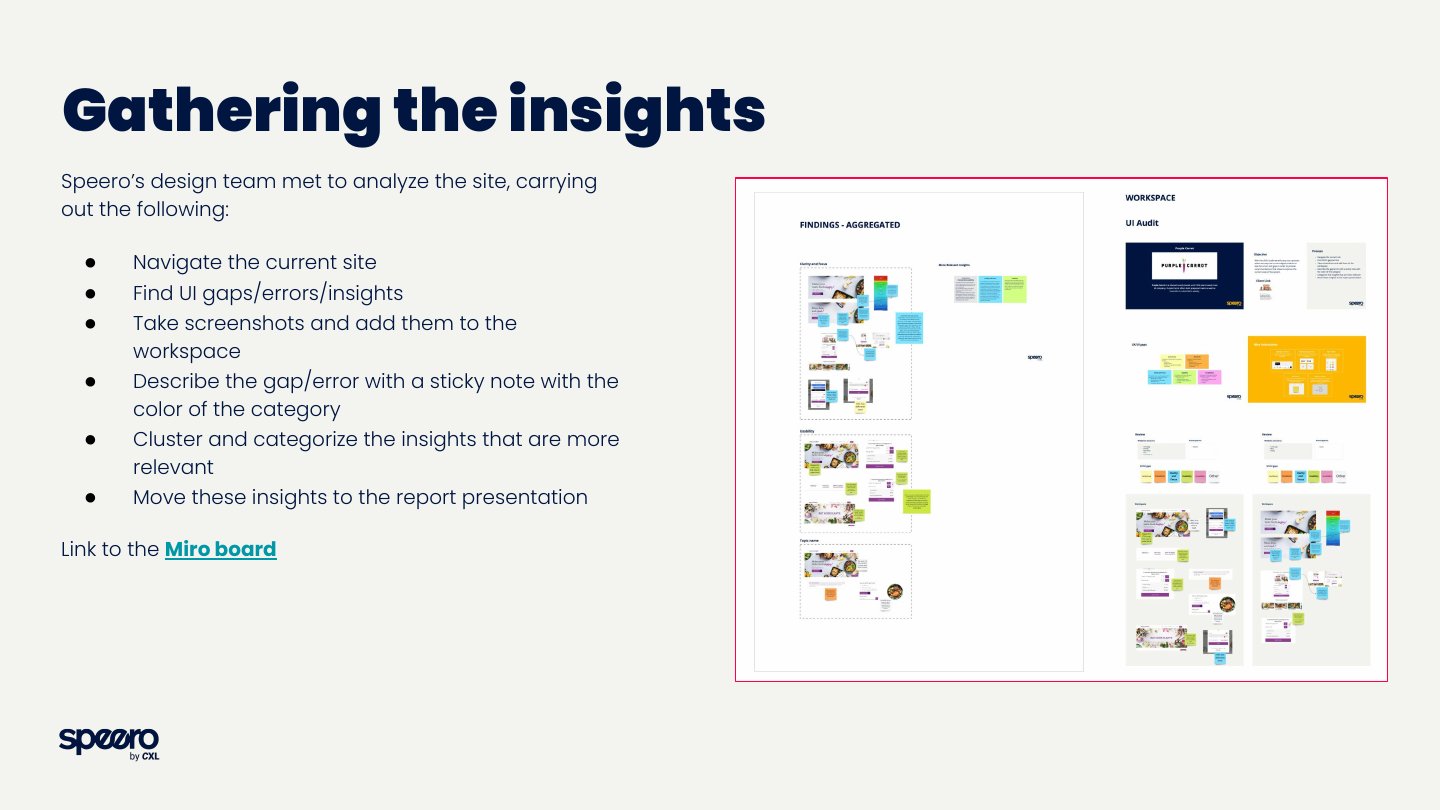
I helped put this method together with the design team. We work on a shared Miro board and finish with a short report for the client.
  1. 1Go through the site
  2. 2Spot gaps and errors
  3. 3Take screenshots
  4. 4Tag each one by principle
  5. 5Group what matters most
  6. 6Put it in a report
The five things I look at
ConsistencyIcons, images, type, brand guidelines and design libraries.
StandardsWeb standards, the right components, common conventions.
Clarity & focusClear hierarchy and visuals that help with the task.
UsabilityEasy to use, clear feedback, nothing to memorize.
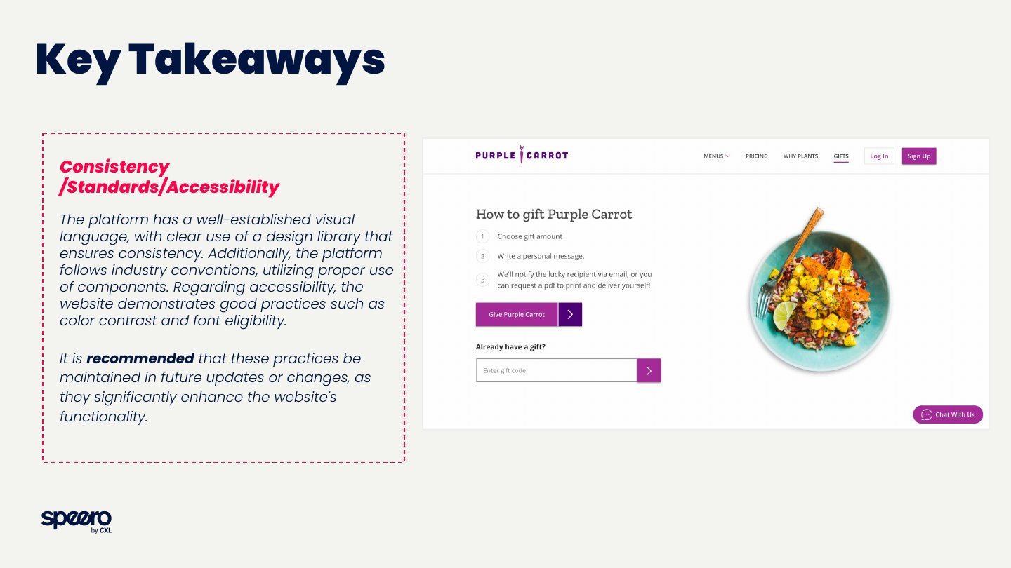
AccessibilityContrast, cues beyond color, readable type.
What the client getsKey takeaways for each one, with screenshots and what to fix first.
Audit slide: gathering insights on a Miro board
Gathering the insights on Miro
Audit slide: key takeaways on consistency, standards and accessibility
Key takeaways, from a real audit for Purple Carrot
Some of the brands

Teams I've designed for.

MongoDB · Miro · ClickUp · Nasdaq · Philips · Cisco · ServiceNow · Gong · Tipalti · Procore · Freshworks · OutSystems · Codecademy · Carrefour · Olaplex · BARK · Purple Carrot · Eventim · Dr. Squatch · Native · The Bouqs Co. and more.
SaaSE-commerceFintechConsumer brands
What I've learned here

One day I'm doing pixel-perfect screens with a client's library. The next I'm sketching ideas for a strategist. Switching that often taught me to adapt fast.

A/B test designUI auditsHeuristic reviewsPage redesignsDesign systemsFigmaClaude
Keep exploring →
See my case studies
All projects →

Let's talk!

I'm looking for a product design role where I can own the experience end to end. If that sounds like your team, I'd love to connect.

Connect on LinkedIn ↗ daleskagm@gmail.com
© 2026 Daleska Granados Illustrations by Streamline
Daleska Granados
← Home
UI designA/B testingDesign systems

My work at Speero

Speero helps brands test and improve their websites. I'm one of the designers. I work every day with strategists, analysts and developers, and my part is the design.

Below, a real test file with the client's brand hidden.

Role
UX & UI designer
Since
2022
Team
Remote, many countries
Tools
Figma · Miro · Claude + more
Original · desktop
Original page, client brand hidden
My variant · mobile
Mobile variant I designed, client brand hidden
What I do

UI design is most of my work, but not all of it.

Most of my time

A/B test design

A strategist brings the idea. I turn it into wireframes and final UI for desktop and mobile. On a normal day that's two tests, sometimes more.

I helped shape the method

UI audits

I look at the visual side of a site, find what feels off and suggest what to fix first.

With the strategists

Heuristic reviews

With the strategists, I go through live sites, mostly online stores, and write down what makes buying harder.

Homepages, product pages, full sites

Page redesigns

Sometimes one test isn't enough and the page needs a full redesign.

In every project

Visual design

Clean UI that matches each brand and is ready for the developers.

Now and then

Speero's own brand

The event t-shirts for two years, presentation templates for client work and a few social posts.

Many clients, many ways of working

A different client almost every day.

Clients change during the week, and each team works its own way. Some want rough ideas, others want final screens that I review with their developers. It has made me quick to adapt, and I like that.

If they have a library

I use their components and keep everything connected in Figma.

If they don't

I study the live site, find the components it uses, rebuild them and organize them into a system.

What a client might ask for
Ideas
Wireframes
Final UI
Pixel perfect for dev
Design systems with Claude

Each client, in one place.

Every client has its own brand, components and rules. With Claude I've built around 14 design systems that keep all of that in one place. When a new test comes in, I start from the right colors, type and components, so my time goes to the idea and the details.

~14
design systems built
One source
for each brand and its components

How a test moves through the team.

Each test goes through several people in different countries, and a project manager keeps it on track. I work close to the CRO side, but I'm the designer. I don't run the analysis.

1StrategistBrings the idea
2MeDesigns it in Figma
3DeveloperBuilds the test
4QAChecks it
5AnalystLooks at the results
UI audits

How I run a UI audit.

I helped put this method together with the design team. We work on a shared Miro board and finish with a short report for the client.

The steps
1Go through the site
2Spot gaps and errors
3Take screenshots
4Tag each one by principle
5Group what matters most
6Put it in a report
The five things I look at
Consistency
Icons, images, type, brand guidelines and design libraries.
Standards
Web standards, the right components, common conventions.
Clarity & focus
Clear hierarchy and visuals that help with the task.
Usability
Easy to use, clear feedback, nothing to memorize.
Accessibility
Contrast, cues beyond color, readable type.
Audit slide: gathering insights on Miro
Gathering the insights on Miro
Audit slide: key takeaways
Key takeaways, from a real audit for Purple Carrot
Some of the brands

Teams I've designed for.

MongoDB · Miro · ClickUp · Nasdaq · Philips · Cisco · ServiceNow · Gong · Tipalti · Procore · Freshworks · OutSystems · Codecademy · Carrefour · Olaplex · BARK · Purple Carrot · Eventim · Dr. Squatch · Native · The Bouqs Co. and more.
SaaSE-commerceFintechConsumer brands
What I've learned here

One day I'm doing pixel-perfect screens with a client's library. The next I'm sketching ideas for a strategist. Switching that often taught me to adapt fast.

A/B test designUI auditsHeuristic reviewsPage redesignsDesign systemsFigmaClaude
Keep exploring →
See my case studies
All projects →

Let's talk!

I'm looking for a product design role where I can own the experience end to end. If that sounds like your team, I'd love to connect.

Connect on LinkedIn ↗daleskagm@gmail.com
© 2026 Daleska Granados · Illustrations by Streamline
Daleska Granados
Work· Experimentation· Teaching
in
← Home
TeachingUX educationCourse design

How I teach UX

I teach UX by using UX. I treat each course like a product and my students like its users, so I keep testing it and making it better with them.

Role
Professor
Where
University of Costa Rica
Courses
Intro to UX · User Research
Tools
FigJam · Figma · Kahoot + more
User Research · Class board
Discover
Desk research
Benchmarking
Stakeholder interviews
What users need
Pain points
Questions for interviews
Define
Journey map made in class
Retro
Liked
The project phases
Using FigJam
Improve
Covers for homework
Tidier deliverables
Ideas
Go deeper into the why
More feedback
Student
Daleska
Student
User Research course

The course is one big project.

Students work on the same project all semester and deliver it in parts every two weeks. Each part uses what we just saw in class, so the topic is still fresh.

1
DiscoverDesk research, benchmarking, stakeholder interviews
2
ExploreObservation, user interviews, finding insights
3
DefinePersonas, journey maps, service blueprints
4
CreateIdeation, wireframes, prototypes
5
TestThink aloud, card sorting, A/B testing

Retrospectives, like in a sprint.

Three times each semester, students answer an anonymous retro. I read every answer and adjust the course while it's still running, not only at the end.

LikedWhat is working for them
“The pace feels right. Not too fast, not too slow.”
“Having only one in-person class a week really helps those of us who work and study.”
“The mind map assignment. It's a really useful resource.”
ImproveWhat I should change
“Theory classes feel heavy. It's a lot of information to process.”
“Many of the links don't work anymore, or the plugin was discontinued.”
IdeasWhat to try next
“Tell us at the start that we can use Figma for Education. Not everyone knows.”
“Active breaks.”
“Games to learn the theory, like Kahoot!”

Real comments from one retro, translated from Spanish.

From the retros

What students value most.

When I ask what went well, these are the things students mention again and again.

12The project, split into phasesmentions
12Working in FigJam and Figmamentions
10How I teach and explainmentions
7Well-organized classesmentions
7Group activities and design critiquesmentions
6Dynamic, interactive classesmentions
"You can tell the professor loves what she teaches."
"The project was big, but it never felt heavy because of how it was divided."
"The tools and material are very up to date. The content is relevant for professional work."
"She explains very well and doesn't use too much jargon."
"I love how well planned the classes are."
"The class information is always visible and easy to find in FigJam."

Anonymous answers, translated from Spanish.

Real tools from day one

They learn in the same tools they'll use at work.

Each course lives in one FigJam board, and students design in Figma. By the time they start their own projects, these tools already feel natural.

Some methods we practice in class
Affinity mappingDesign StudioRound RobinPositive · Negative · OpportunityDecision matrixGroup work in breakout rooms

Plus Kahoot games and other tools I keep trying in class.

Intro to UX course

The basics, with a first real project.

Students build their first portfolio piece and finish with "My first UX project", using what they learn each week.

What we cover
  1. 1What UX is and where it comes from
  2. 2UX and related disciplines
  3. 3Accessibility and usability
  4. 4Heuristics, UX laws and design principles
  5. 5Research methods
  6. 6Flows and information architecture
  7. 7Wireframes and prototyping
  8. 8Testing and deliverables
Beyond the classroom

Thesis projects and a new curriculum.

New this semester

Guiding thesis projects

I advise UX graduation projects, from the first research plan to the final design.

Licentiate program

A new UX curriculum

I helped redesign the UX licentiate curriculum, rebuilding the whole program from scratch.

What teaching gives back

If my students get stuck, I treat it as a design problem I can fix. That habit makes me a better designer too.

Course designFacilitationRetrospectivesUser researchService designFigJamFigma
Keep exploring →
See my case studies
All projects →

Let's talk!

I'm looking for a product design role where I can own the experience end to end. If that sounds like your team, I'd love to connect.

Connect on LinkedIn ↗ daleskagm@gmail.com
© 2026 Daleska Granados Illustrations by Streamline
Daleska Granados
← Home
TeachingUX educationCourse design

How I teach UX

I teach UX by using UX. I treat each course like a product and my students like its users, so I keep testing it and making it better with them.

Role
Professor
Where
University of Costa Rica
Courses
Intro to UX · User Research
Tools
FigJam · Figma · Kahoot + more
User Research · Class board
Discover
Desk research
Benchmarking
Stakeholder interviews
What users need
Pain points
Questions for interviews
Define
Journey map made in class
Retro
Liked
The project phases
Using FigJam
Improve
Covers for homework
Tidier deliverables
Ideas
Go deeper into the why
More feedback
Student
Daleska
Student
User Research course

The course is one big project.

Students work on the same project all semester and deliver it in parts every two weeks. Each part uses what we just saw in class, so the topic is still fresh.

1
Discover
Desk research, benchmarking, stakeholder interviews
2
Explore
Observation, user interviews, finding insights
3
Define
Personas, journey maps, service blueprints
4
Create
Ideation, wireframes, prototypes
5
Test
Think aloud, card sorting, A/B testing

Retrospectives, like in a sprint.

Three times each semester, students answer an anonymous retro. I read every answer and adjust the course while it's still running, not only at the end.

LikedWhat is working for them
“The pace feels right. Not too fast, not too slow.”
“Having only one in-person class a week really helps those of us who work and study.”
“The mind map assignment. It's a really useful resource.”
ImproveWhat I should change
“Theory classes feel heavy. It's a lot of information to process.”
“Many of the links don't work anymore, or the plugin was discontinued.”
IdeasWhat to try next
“Tell us at the start that we can use Figma for Education. Not everyone knows.”
“Active breaks.”
“Games to learn the theory, like Kahoot!”

Real comments from one retro, translated from Spanish.

From the retros

What students value most.

When I ask what went well, these are the things students mention again and again.

12The project, split into phasesmentions
12Working in FigJam and Figmamentions
10How I teach and explainmentions
7Well-organized classesmentions
7Group activities and design critiquesmentions
6Dynamic, interactive classesmentions
"You can tell the professor loves what she teaches."
"The project was big, but it never felt heavy because of how it was divided."
"The tools and material are very up to date. The content is relevant for professional work."
"She explains very well and doesn't use too much jargon."
"I love how well planned the classes are."
"The class information is always visible and easy to find in FigJam."

Anonymous answers, translated from Spanish.

Real tools from day one

They learn in the same tools they'll use at work.

Each course lives in one FigJam board, and students design in Figma. By the time they start their own projects, these tools already feel natural.

Some methods we practice in class
Affinity mappingDesign StudioRound RobinPositive · Negative · OpportunityDecision matrixGroup work in breakout rooms

Plus Kahoot games and other tools I keep trying in class.

Intro to UX course

The basics, with a first real project.

Students build their first portfolio piece and finish with "My first UX project", using what they learn each week.

What we cover
1What UX is and where it comes from
2UX and related disciplines
3Accessibility and usability
4Heuristics, UX laws and design principles
5Research methods
6Flows and information architecture
7Wireframes and prototyping
8Testing and deliverables
Beyond the classroom

Thesis projects and a new curriculum.

New this semester

Guiding thesis projects

I advise UX graduation projects, from the first research plan to the final design.

Licentiate program

A new UX curriculum

I helped redesign the UX licentiate curriculum, rebuilding the whole program from scratch.

What teaching gives back

If my students get stuck, I treat it as a design problem I can fix. That habit makes me a better designer too.

Course designFacilitationRetrospectivesUser researchService designFigJamFigma
Keep exploring →
See my case studies
All projects →

Let's talk!

I'm looking for a product design role where I can own the experience end to end. If that sounds like your team, I'd love to connect.

Connect on LinkedIn ↗daleskagm@gmail.com
© 2026 Daleska Granados · Illustrations by Streamline
Daleska Granados
Work· Experimentation· Teaching
in

All projects

Work for 20+ brands at Accenture, Speero and as a freelancer.

At Accenture
Salesforce · UBS · Banistmo · McKesson · Cisco · Caterpillar · Golden State Warriors · Sprint · Nadro · Signet · Southern Company and more
BankingHealthcareTelecomSportsEnergyRetailEnterprise software
At Speero
MongoDB · Miro · ClickUp · Nasdaq · Philips · Cisco · ServiceNow · Gong · Tipalti · Procore · Freshworks · Purple Carrot and more →
SaaSE-commerceFintechConsumer brands
Case studies

Three projects, in detail.

Warriors app home with the Unstoppable bannerStep counter with the rainbow ringChoose a cause: Pride, anti-racism or both
Sports
Pride Unstoppable
A step counter so fans could keep marching.
Redesigned Partner Community homepage
Enterprise SaaS
Salesforce Partner Community
Research and design with 44 partners in 4 regions.
Sign-up step 1 wireframe
Soft Token confirmation wireframe
Fingerprint activation wireframe
Fintech
Banistmo Digital Banking
Information architecture and flows for three banking audiences.
More work

Other projects at a glance.

Most of this work is under NDA. I'm happy to walk you through any of it in a call.

Fintech

UBS Advisory Platform

Heuristic review, research planning and interaction design for the tools wealth advisors use every day.

Heuristic evaluation · Wireflows · UI
Healthcare

McKesson

Restructured a clinical mobile app for iOS and Android, and supported engineering through QA.

Mobile · Flows · Dev support
Healthcare

Nadro

Turned a legacy pharmaceutical website into a mobile-first responsive product.

Responsive · Mobile-first
Enterprise software

Career Counselor Matching

A web app that matches people with the right advisor, from flows to final UI.

Matching · Web app · UI
Enterprise software

Marketing Operations

An internal platform built from scratch: journey map, architecture, wireflows and UI.

Journey map · IA · UI
Enterprise software

Marketing Academy

Extended a learning platform across web and mobile with a consistent experience.

Learning · Web & mobile
Enterprise software

Accenture Design Hub

Took a mobile product to tablet and desktop, so it could grow across screens.

Responsive · Scalability
Telecom

Sprint

A mobile chatbot, then a decision dashboard shaped in a two-day workshop I designed.

Chatbot · Dashboard · Facilitation
Workshops

Thoth

A chatbot testing framework built through Design Thinking workshops.

Workshops · Testing plan
Consumer apps

Residential Community App

Freelance, end to end: 7 interviews, user typologies, wireflows and the first UI.

Research · Mobile · UI
Nonprofit

NGO Digital Platform

Graduation project: one platform for humanitarian NGOs, tested with 9 users.

End-to-end · Design system
Energy

Southern Company

Ideation, user flows and UI concepts for a new web platform.

Flows · Mockups · UI

Let's talk!

I'm looking for a product design role where I can own the experience end to end. If that sounds like your team, I'd love to connect.

Connect on LinkedIn ↗ daleskagm@gmail.com
© 2026 Daleska Granados Illustrations by Streamline
Daleska Granados

All projects

Work for 20+ brands at Accenture, Speero and as a freelancer.

At Accenture
Salesforce · UBS · Banistmo · McKesson · Cisco · Caterpillar · Golden State Warriors · Sprint · Nadro · Signet · Southern Company and more
BankingHealthcareTelecomSportsEnergyRetailEnterprise software
At Speero
MongoDB · Miro · ClickUp · Nasdaq · Philips · Cisco · ServiceNow · Gong · Tipalti · Procore · Freshworks · Purple Carrot and more →
SaaSE-commerceFintechConsumer brands
Case studies

Three projects, in detail.

Warriors app home with the Unstoppable bannerStep counter with the rainbow ringChoose a cause: Pride, anti-racism or both
Sports
Pride Unstoppable
A step counter so fans could keep marching.
Redesigned Partner Community homepage
Enterprise SaaS
Salesforce Partner Community
Research and design with 44 partners in 4 regions.
Sign-up step 1 wireframe
Soft Token confirmation wireframe
Fingerprint activation wireframe
Fintech
Banistmo Digital Banking
Information architecture and flows for three banking audiences.
More work

Other projects at a glance.

Most of this work is under NDA. I'm happy to walk you through any of it in a call.

Fintech

UBS Advisory Platform

Heuristic review, research planning and interaction design for the tools wealth advisors use every day.

Heuristic evaluation · Wireflows · UI
Healthcare

McKesson

Restructured a clinical mobile app for iOS and Android, and supported engineering through QA.

Mobile · Flows · Dev support
Healthcare

Nadro

Turned a legacy pharmaceutical website into a mobile-first responsive product.

Responsive · Mobile-first
Enterprise software

Career Counselor Matching

A web app that matches people with the right advisor, from flows to final UI.

Matching · Web app · UI
Enterprise software

Marketing Operations

An internal platform built from scratch: journey map, architecture, wireflows and UI.

Journey map · IA · UI
Enterprise software

Marketing Academy

Extended a learning platform across web and mobile with a consistent experience.

Learning · Web & mobile
Enterprise software

Accenture Design Hub

Took a mobile product to tablet and desktop, so it could grow across screens.

Responsive · Scalability
Telecom

Sprint

A mobile chatbot, then a decision dashboard shaped in a two-day workshop I designed.

Chatbot · Dashboard · Facilitation
Workshops

Thoth

A chatbot testing framework built through Design Thinking workshops.

Workshops · Testing plan
Consumer apps

Residential Community App

Freelance, end to end: 7 interviews, user typologies, wireflows and the first UI.

Research · Mobile · UI
Nonprofit

NGO Digital Platform

Graduation project: one platform for humanitarian NGOs, tested with 9 users.

End-to-end · Design system
Energy

Southern Company

Ideation, user flows and UI concepts for a new web platform.

Flows · Mockups · UI

Let's talk!

I'm looking for a product design role where I can own the experience end to end. If that sounds like your team, I'd love to connect.

Connect on LinkedIn ↗daleskagm@gmail.com
© 2026 Daleska Granados · Illustrations by Streamline
Daleska Granados
  • Work →
  • Experimentation →
  • Teaching →
Connect on LinkedIn ↗ daleskagm@gmail.com